Checklists
Checklists Overview
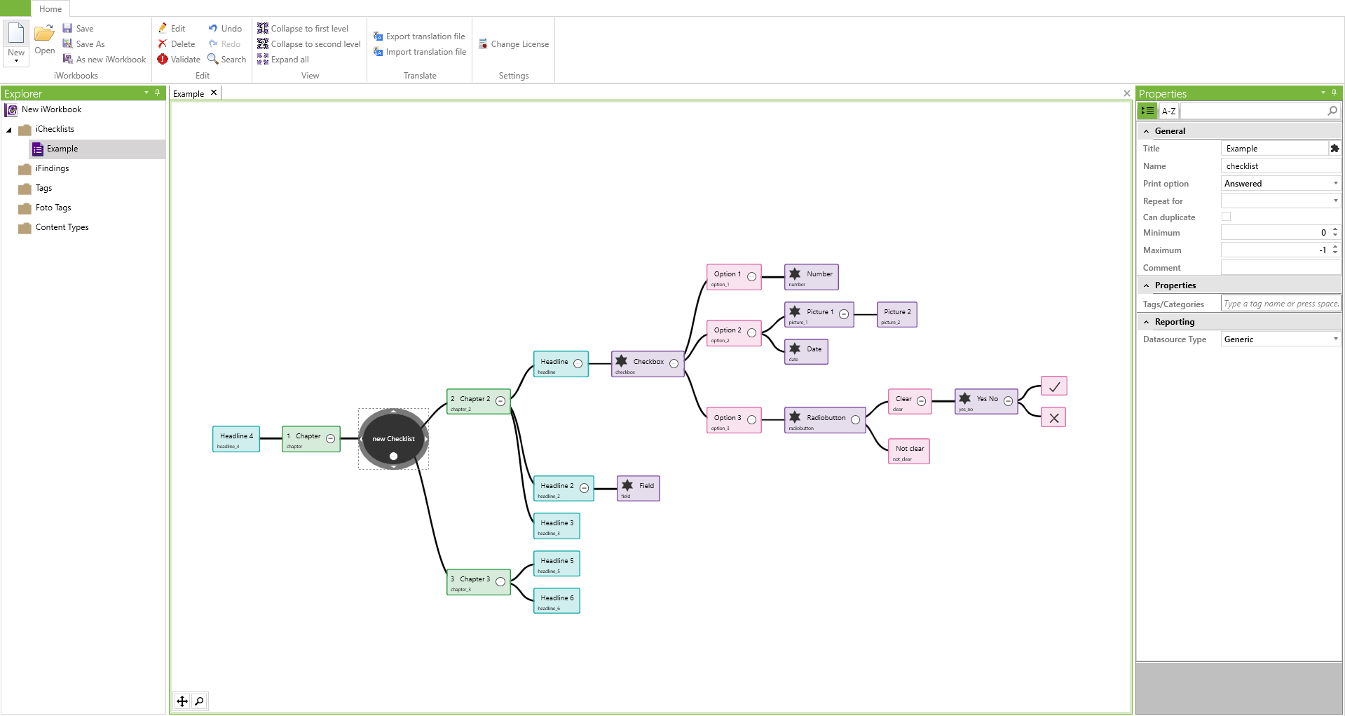
Checklists are the core of the iCL Designer. They can be used to create and map complex question and answer scenarios in a clear form.
Creating Checklists
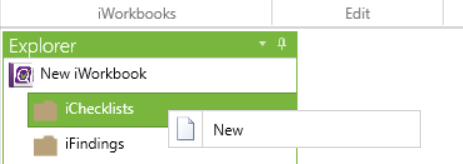
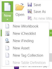
A checklist can be created in the Explorer area by right-clicking on iChecklists and selecting New or via the New button under the blank sheet symbol. Any of these ways can be repeated to create multiple checklists.
Checklist Structure
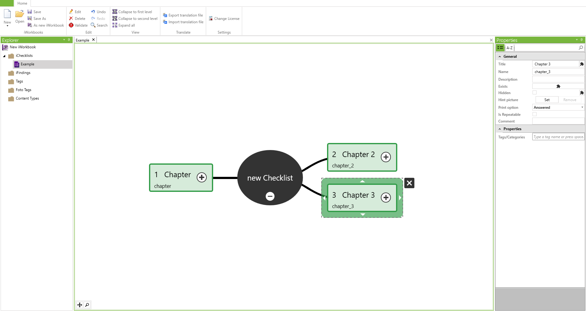
The black checklist node is the visual representation of the checklist in the main window.
In a checklist, the first two levels of nodes will always be created as green chapters and turquoise headlines. Beyond that, there is no restriction for nodes.
Please keep in mind, that a purple field node can only be attached to headlines, other fields or the pink answers of an answer-node.
Checklist Settings
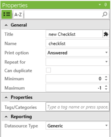
The selection of a checklist via the Explorer or in the main window opens the properties of this checklist, where the following settings can be defined:
| Name | Description |
|---|---|
| Title | Defines the display name in the iCL Filler. |
| Name | Defines the internal name for this field. |
| Print option | Always: Displays all fields included in the report, whether or not they have been completed. |
| Answered: Displays only completed fields in the report. | |
| Never: Does not display any questions from this checklist included in the report. | |
| Repeat for | A field for repeating the checklist with content types - more about this can be found in the chapter Content Types. |
| Can duplicate | Allows the iCL Filler to duplicate this checklist. |
| Minimum | Defines, how often this checklist is minimally available. If 0, the checklist must be created manually in the iCL Filler so that it can be filled out. |
| Maximum | Defines the maximum number of times this checklist is available. With -1, the checklist can be created in the iCL Filler as often as required. |
| Data source Type |
Nodes Overview

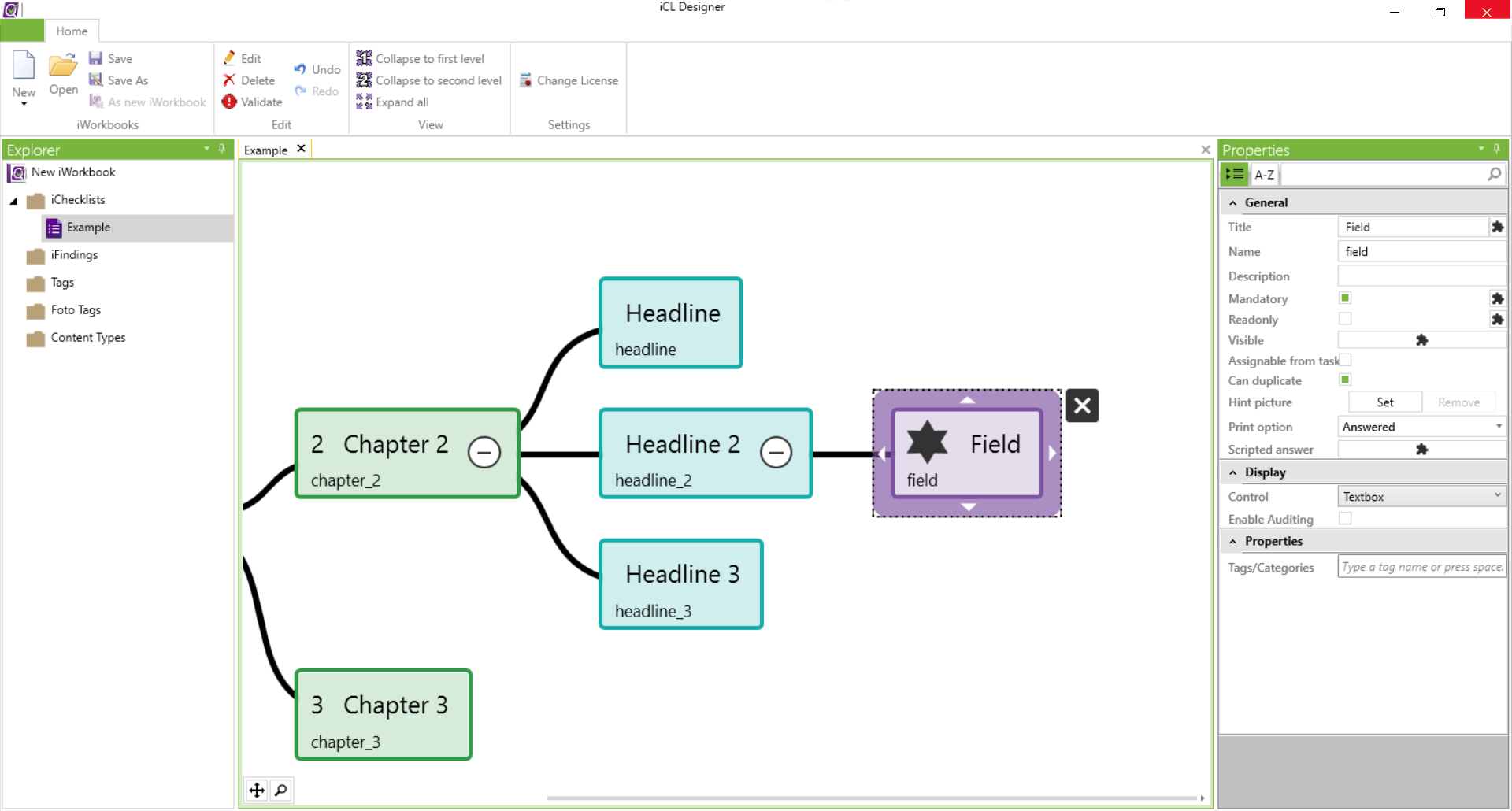
Each node within a checklist represents a separate field that can be configured differently.
In a node, several things are visible at first sight.
The dotted line around the node indicates its selection.
A black star indicates a mandatory node that must be filled in the iCL Filler to be able to complete the inspection. If the star is missing, it is an optional question node.
The title of a node is placed in large font in the center. The smaller name below contains the internal node name and has to be unique in each checklist. This becomes more relevant when scripting with blockly. See the Scripts chapter for more information.
If a node has subsequent nodes, this is indicated by a white circle containing a + or -. These subsequent nodes can be shown and become hidden by clicking on the circle.
Node Levels
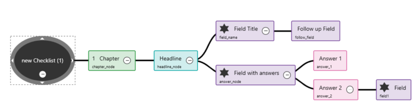
Each checklist has a basic structure consisting of main nodes, chapters, headlines and fields.
| Field | Type | Description |
|---|---|---|
 | Checklist node | The core of any checklist from which all other nodes originate. |
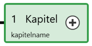 | Chapter | All fields derived from the checklist node are chapters. |
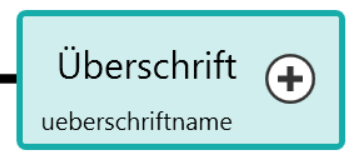 | headlines | All fields derived from chapters are headlines that serve for further subdivision within a chapter. |
 | Questions | All fields derived from headlines are questions that serve as input fields. |
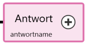 | Answers | Answer fields are always associated with question fields. Further question fields can be derived from answer fields. |
 | Finding | These fields exist in finding catalogs and can be associated with other finding fields. |
Each checklist can have any number of chapters with any number of headlines and any number of fields.
Follow up Fields
- Follow-up fields that are attached to other fields are not displayed in the iCL Filler until the previous field has been answered and is visible.
- Follow-up fields that are attached to answers are not displayed in the iCL Filler until this answer has been selected.
Create Fields
Depending on the current node selection, fields of different types are created.
Two buttons are available for creating new fields:
| Button | Function |
|---|---|
| Enter | Press the Enter key to create a new field of that layer under the currently selected field. |
| Tabulator | With the Tabulator key, a field is created on the next level. |
Since the main node cannot have a second level of equal rank, the first new field is created using the Tabulator key.
Remove Fields
A field can be deleted either by hovering over the field and hit the X adjacent to the field, or after selecting the field and hit the Delete key (del).
Cut/Move/Paste Fields
A field can be attached to other areas of the checklist with the mouse using the Drag&Drop function and thus moved.
Fields can be cut to the clipboard with the key combination CTRL+X or copied to the clipboard with CTRL+C. Fields can be appended to a selected field with CTRL+V. (if the selected field is compatible with the field to be appended)
Changing the colors of the Fields
You can change the color of the nodes (except the root nodes which are always black) in the workbook.

Using the automatic color of the color picker, you can change the color back to the default color (e.g. green for chapters) at any time.
Chapter
Chapters are derived from the main node of a checklist. They allow a clear navigation in the iCL Filler and a clear division of topics.
Chapter Properties
| Option | Function |
|---|---|
| Title | Defines the display name. |
| Name | Defines the internal name. |
| Description | Allows you to store a further information text for this field, which can be retrieved in the iCL Filler. |
| Visible | A field for Blockly scripts to show or hide this chapter under certain conditions. |
| Hint picture | Allows you to add a picture to this field for further explanation. |
| Print option | |
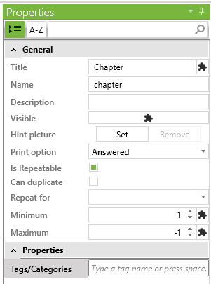
| is Repeatable | Opens configuration settings for repeating chapters. The minimum and maximum number of chapters can be defined. A minimum value of 0 means that this chapter is not activated by default and must be added first. A maximum value of -1 means that any number of chapters can be created. Blockly scripts can also be created to control the number. |
Headlines
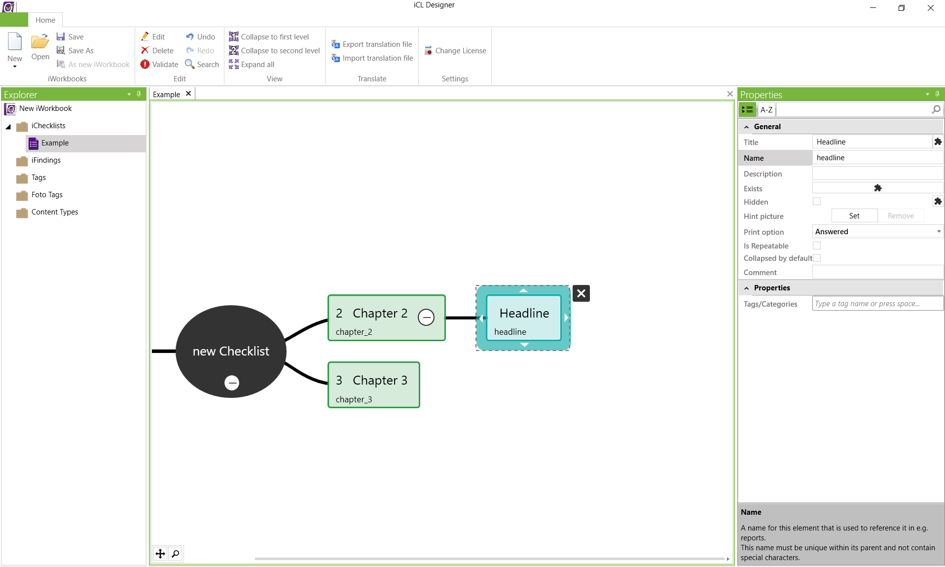
Headlines are always direct successors of chapters. They are subchapters and serve to further subdivide topics.
Headline Properties
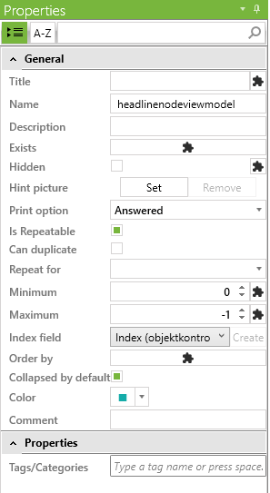
| Option | Function |
|---|---|
| Title | Defines the display name. |
| Name | Defines the internal name. |
| Description | Allows you to store a further information text for this field, which can be retrieved in the iCL Filler. |
| Exists | A boolean blocky scripts that controls, if this field does exist or not. |
| Hidden | A field for Blockly scripts to show or hide this headline under certain conditions. |
| Hint picture | Allows you to add a picture to this field for further explanation. |
| Print option | |
| is Repeatable | Opens configuration settings for repeated display of headlines. The minimum and maximum number of headlines can be defined. A minimum value of 0 means that this heading is not activated by default and must first be added. A maximum value of -1 means that any number of headlines can be created. Blockly scripts can also be created to control the number. |
| Index field | Defines one number field within this headline to be an index field, which receives an automatic number when assigned here. |
| Order by | A script to define the sorting order if this headline is set to repeatable. |
| Collapsed by default | If true, the headline will be collapsed by default. |
| Color | Sets the color of this headline. |
| Comment | An internal field for specific comments to this headline - will not be shown in the iCL Filler. |
Fields
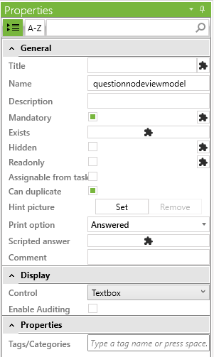
Fields are all other, deeper elements of a checklist. They can be derived from a heading, question or answer field.
Field Properties
| Textbox | Checkbox |
|---|---|
 | 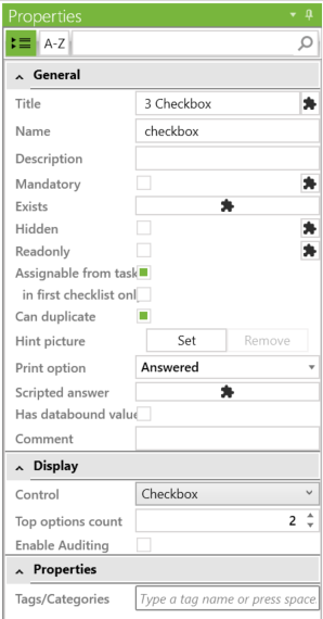 |
| Option | Function |
|---|---|
| Title | Defines the display name. |
| Name | Defines the internal name. |
| Description | Allows you to store a further information text for this field, which can be retrieved in the iCL Filler. It is also possible to embed markdown links via [Text](URL) like [Opti-Q Website](http://www.opti-q.com) |
| Mandatory | A field that is set to "mandatory" must be answered in the iCL Filler before the final report can be created. |
| Readonly | By setting "readonly" this question cannot be changed in the iCL Filler. Answers can be stored e.g. with Blockly-Scripts or by Tasks. |
| Visible | A field for Blockly scripts to show or hide this chapter under certain conditions. |
| Assignable from task | Allows this field to be populated with a predefined Excel file uploaded to the iCL Portal under Inspections to be retrieved in the iCL Filler under Tasks. |
| In First Checklist only | Only visible, if the 'Assignable from task' or 'Autofill' option is selected. This option prevents the field to be prefilled with data from tasks or content items, if it is not located in the first checklist of the workbook. |
| Can duplicate | Defines whether or not the response to a question is copied when it is duplicated. To do this, the corresponding chapter or heading must be defined as repeatable. By default, photos or drawings are marked as not copyable. Signatures and audio recordings cannot be copied. |
| Hint picture | Allows you to assign a picture to this field for further explanation. |
| Print option | Answered: if this field is filled in, it will also be displayed (by default) in the report. |
| Always: This field is always displayed in the report, regardless of whether it was filled in or not. | |
| Never: This field is not displayed in the report under any circumstances. | |
| Scripted answer | Allows the content to be filled using a Blockly Script. |
| Color | Sets the color of this headline. |
| Comment | A note field to add some additional information about the field. |
| Control | Here the most different input types can be selected. |
| Enable Auditing | If a field with enabled auditing is answered or changed, the entry is extended by a time and user entry. |
| Top options count | The number of options that are displayed to the inspector. If the number of available options exceeds this value, the multi-select dropdown UI will show. The default value is 8. |
Basic Field Types
| Field type | Description |
|---|---|
| Textbox | You can give an answer to the text in the title by entering characters. |
| Multiline Textbox | Like the textbox, only with a multiline textbox for a better overview with longer texts. |
| Number | A field in which only numbers can be entered. |
| Parameter: Decimal places - sets the amount of decimal places. | |
 | Parameter: Enable incr/decr - enables showing increment and decrement buttons next to the numeric field. When enabled, you can also specify the amount of increment/decrement. |
| Take a picture | A field for creating or inserting photos or pictures. |
| Parameter: Allow Gallery - allows to select pictures from the gallery. | |
| Parameter: Picture Sizes - sets the size of the image - Inherit/Small/Medium/Large | |
| Date picker | A field for entering a date. |
| Time picker | A field for entering a time. |
| Date format | Here you can define a format for the display of date fields. By default, the value is set to "inherit", which means that the value is taken from the workbook. |
Date Format Property

For the display of the selected date the iCL Filler uses the "short date" standard format. Depending on the region the end device
is set to, the date will then be displayed differently. For a user from the USA the format MM/dd/yyyy is used, the French format
is dd/MM/yyyy, and the German dd.MM.yyyy. The date format property offers the possibility to set an individual format here,
where you can choose from the standard formats, as well as define your own formats. To help you with this, there is a dialog that
shows you the result. You can call it via the "Test" button.
Answer Field Types
These field types either have predefined answers or can be extended with any number of answers. This is done by clicking on the question field and the Tabulator key, or by clicking on an existing answer field and pressing the Enter key.
| Field Type | Number of Answer Fields | Description |
|---|---|---|
| Checkbox | Any number | Checkboxes allow you to check any number of answers. In Blockly scripts checkbox-fields return their selected values as a list. |
| Radiobutton | Any number | For radio boxes only one answer can be selected at a time. All answers are listed visibly. |
| Dropdown | Any number | Answers for this field are only listed when the dropdown area is selected. |
| Yes/No | 2 | The answers are displayed as checkmark and X. Only one state can be active at a time. |
| 3-Button | 3 | An advanced Yes/No query with 3 answer fields, which can also be individualized from the title with a maximum of 8 characters. |
Each answer field has a Value property in which an unique value for this answer can be stored. If this property is not set, the title is automatically taken as the value. The value entry can also be a number and is interpreted accordingly, e.g. you can calculate with it. For more details see chapter Scripts.
Properties for Answer Fields
| Option | Function |
|---|---|
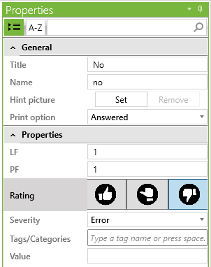
| LF | Used for calculations in the report. |
| PF | Used for calculations in the report. |
| Rating | Positive: Defines if the answer is evaluated as positive which can be used in calculations and in the reporting. |
| Neutral: Defines if the answer is evaluated as neutral which can be used in calculations and in the reporting. | |
Negative: Defines if the answer is evaluated as negative which can be used in calculations and in the reporting. When this rating is selected the Severity dropdown appears in the Properties window. | |
| Severity | Possible values are Error and Warning. This provides visual feedback in the Filler application. |
| Error: Defines if the answer is rated as an error (standard value). When any error answer is selected then the parent chapter and headline circle is colored red. | |
| Warning: Defines if the answer is rated as a warning. When at least one warning answer is selected then the parent chapter and headline circle is colored yellow. |
Special Field Types
| Field type | Description |
|---|---|
| Signature | A field for entering a signature. It will be reset if another field within its responsibility is modified. This ensures that the answers have not been subsequently modified. Responsibility: workbook, checklist or none (in which case the signature will never be reset). |
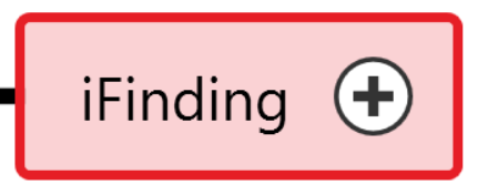
| Add iFindings from catalog | With iFinding fields the question can be assigned as many iFinding catalogs as desired. These question catalogs can be arranged treelike and show texts. |
| Content Item | Content Types are tabular entries obtained from the iCL that can be included in the iWorkbook. |
| Scan QR- or Barcode | Reads a QR- or barcode via the camera; the code cannot be edited afterwards. |
| Record Audio | Allows the recording of voice messages. |
| Save Location | Allows the storage of GPS data. |
| Draw a sketch | Allows the creation of drawings. |
| Plan | Allows storing plans. |
| Locate item on plan | Saves a location (such as a pin or polygon) of an item on a plan. Requires to be assigned to a plan field. |
| Description | The 'Description' field is a simplified field type, which has fewer properties than the other fields. This type is used to display a description defined in markdown format. This can be a static description or a blockly script. The 'Description' field has no value and thus cannot be used in other scripts and is also never displayed in the report. You can read more about basic markdown syntax here. |
The description field only supports the following markdown syntax subset:
# Headline 1
## Headline 2
### Headline 3
#### Headline 4
##### Headline 5
_italic_
**bold**
`code block`

- Bulletpoint list
- second entry

1. numbered list
2. second entry

[a link](https://www.opti-q.com)
Node Context Menu
By right-clicking any node, a context menu will show up.
That allows you to expand subnodes of that tree. You are able to choose how many levels of subnodes you want to show from 1-3 up to all.

| Option | Description |
|---|---|
| Expand subtree | Opens up every level of fields dependent on the selected one. |
| Expand 1 level only | Opens only the next level of fields connected to the selected one. |
| Expand 2 levels only | Opens up to 2 levels of fields connected to the selected one. |
| Expand 3 levels only | Opens up to 3 levels of fields connected to the selected one. |
| Find Dependents | This option lists all fields within this checklist, which use the current field in a blockly script - so all fields that depend on the current one. |
| Find Precedents | This option lists all fields that are used by the current field in any of its blockly scripts - so all fields the current one depends on. |
Alternatively, you can click the + or - on a node to expand or collapse that nodes subnodes.